Merhabalar!
There is a project about Material Style Xamarin Forms Card with XAML. It will look like that:

Let’s Start
Material Cards with XAML
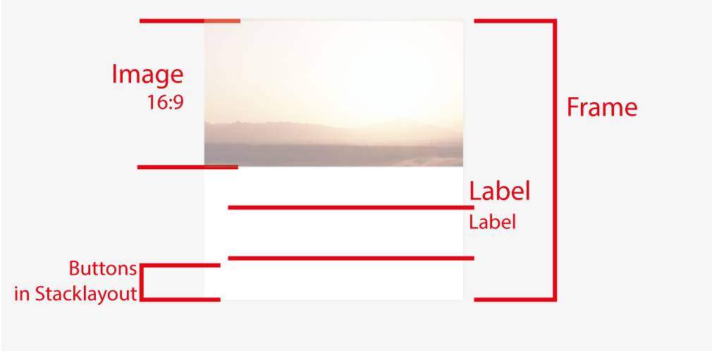
Before we start, firstly we need to know Frame control in XF has a shadow. We can use Frame to create our card. Frames has 20 Padding as Default. If you have some problems with it check your padding is zero or not.
 Our first Card will be look like that “Kangaroo Valley Safari card in that link.
So we need a Frame and some more componenets. Let’s start with a creating a Control in different file. We can use our little card in different project later. Create a Controls Folder in PCL project and Created a XAML component.
This is our logic:


So our XAML is look like:
<label></label>
<label></label>
<label></label>
<label></label>
<label></label>
And we need something to add with CS like giving a ratio to our image (16:9)
Cs file will be like:
{
public CardView()
{
InitializeComponent();
}
protected override void OnSizeAllocated(double width, double height)
{
base.OnSizeAllocated(width, height);
boxCardColor.HeightRequest = boxCardColor.Width / 16 * 9;
imgCard.HeightRequest = imgCard.Width / 16 * 9;
}
private void Card_Tapped(object sender, EventArgs e)
{
Navigation.PushAsync(new Views.CardDetail()); //we'll that page later
}
}
Our Card is ready. Let’s try it. Create a Views folder and Create a ContentPage which named as CardsPage. So we need to call our Controls namespace in XAML. I’ve added that line into ContentPage tag
xmlns:controls=”clr-namespace:MaterialImageAndText.Controls”
finally that page’s XAML will be that:
It’s easy. We got that view on screen:

Material Detail Page with XAML
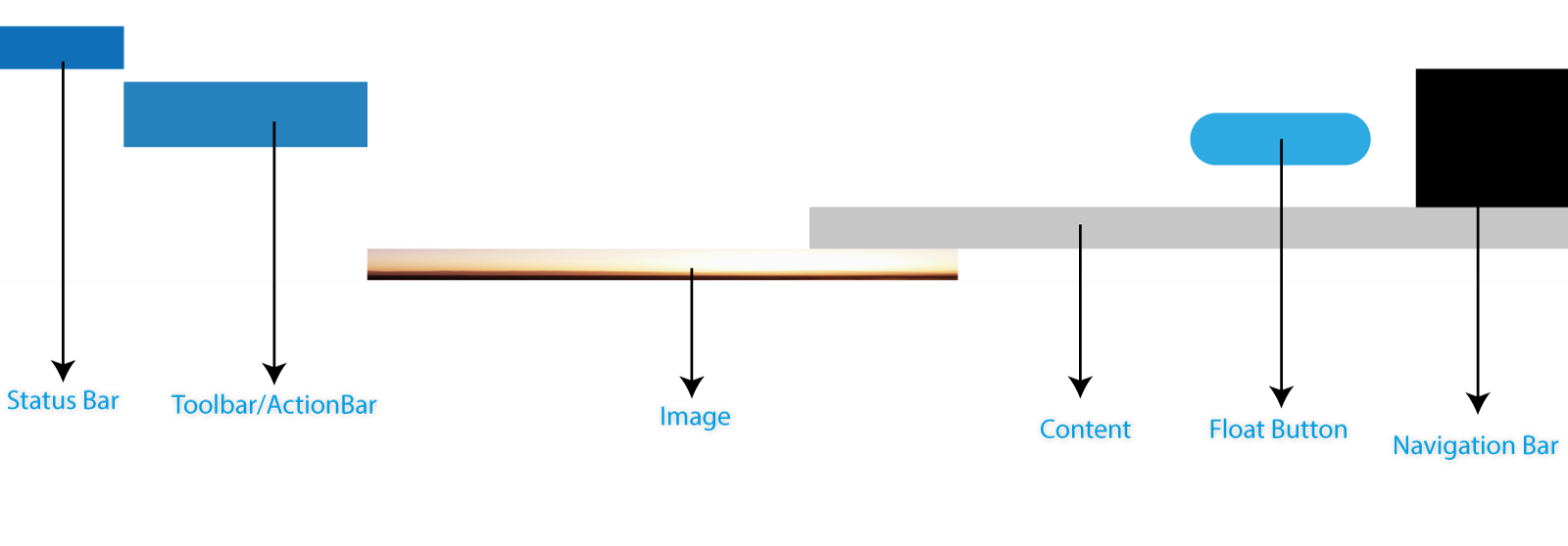
Firsly we need to understand the logic again. Grid allows exacty allocate componenets. And if you put more componenets than one in same cell in grid, last componenet will be paced the top. In that logic I’ll put my Image first to place bottom and my content will be drawing on Image. When I scroll the page Content will be able to move over Image. And The lastly, My float button will be toppest.
For the understanding Grid logic and Material Design. We need not to think Horizontal or Vertical, We need to thing depth.

Let’s start to build that Design with XAML. I’ve created a ContentPage and named it as “CardDetail” in Views folder. XAML page looks like :
<label></label>
<label></label>
Lorem ipsum dolor sit amet, consectetur adipiscing elit. Nunc nulla ligula, viverra ac dictum ac, pellentesque ut est. Quisque sapien lorem, iaculis sed lacinia vel, fringilla et tellus. Fusce auctor tincidunt felis. Ut faucibus ultricies nisi, vitae tristique mauris aliquet vel. Cras vel congue risus. Sed sodales ultrices risus, eu convallis tortor luctus id. Lorem ipsum dolor sit amet, consectetur adipiscing elit. Vestibulum ante ipsum primis in faucibus orci luctus et ultrices posuere cubilia Curae; Vestibulum ultricies pretium ultrices. Quisque rutrum feugiat ante. Donec nec purus facilisis, convallis diam vitae, condimentum nibh. Ut tincidunt, sapien in porttitor ultrices, lacus orci sagittis metus, at hendrerit arcu metus sed tortor.
All the things will be placed over and over. We need a alignment with CS. Just override OnSizeAllocated and use that codes:
{
base.OnSizeAllocated(width, height);
imgCard.HeightRequest = imgCard.Width * 2 / 3; // set the height of Image to 3:2 Ratio
//This keeps all margin as same value which given from XAML. Only changes Top Margin as Image height
grdContentArea.Margin = new Thickness(grdContentArea.Margin.Left, imgCard.Height, grdContentArea.Margin.Right, grdContentArea.Margin.Bottom);
//Set the content height as scrollable
grdContentArea.HeightRequest = grdContentArea.Height > this.Height ? grdContentArea.Height : this.Height;
//boxCardColor.HeightRequest = boxCardColor.Width / 16 * 9;
}
And we need animation now. Our animation depends on scroll gestures. Image will be go up when user scrolled down but not same ratio with scrolling. Our ratio is half of scroll. And for the float button that ratio is 20% of scrolled value.
Finally CS file will be like:
{
public CardDetail()
{
InitializeComponent();
}
protected override void OnSizeAllocated(double width, double height)
{
base.OnSizeAllocated(width, height);
imgCard.HeightRequest = imgCard.Width * 2 / 3; // set the height of Image to 3:2 Ratio
//This keeps all margin as same value which given from XAML. Only changes Top Margin as Image height
grdContentArea.Margin = new Thickness(grdContentArea.Margin.Left, imgCard.Height, grdContentArea.Margin.Right, grdContentArea.Margin.Bottom);
//Set the content height as scrollable
grdContentArea.HeightRequest = grdContentArea.Height > this.Height ? grdContentArea.Height : this.Height;
//boxCardColor.HeightRequest = boxCardColor.Width / 16 * 9;
}
private void ScrollView_Scrolled(object sender, ScrolledEventArgs e)
{
imgCard.TranslateTo(0, -1 * (e.ScrollY / 2), 2);
if (e.ScrollY < imgCard.Height)
{
imgFloatButton.TranslateTo(0,e.ScrollY /5, 25);
}
else
{
imgFloatButton.TranslateTo(0, this.Height - imgFloatButton.Height, 100);
}
}
}
And it’s ready!!
Awesome Material Design.
Source code and Sample project is available on my Git.hub
There is a link you can download


Please That Parallax effect when you scroll after typing the card , could you please help me to do it in XF ? i’ve searched all the web but i couldn’t find anything …
ad.ho@yahoo.com